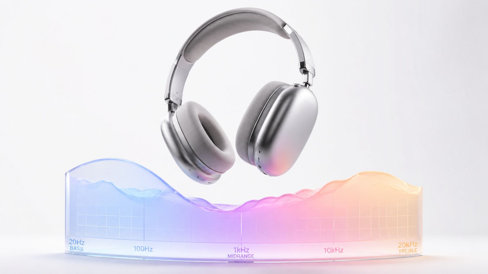
Flat is not the holy grail of headphone frequency response, it's usually a fantasy glued to a spec sheet. What matters is the curve, the seal, and the mess your ears make of both. The graph is useful, but only if you stop pretending it's a verdict.
I've measured enough headphones to know the same model can sound like a careful monitor one day and a bass-tilted gremlin the next, depending on fit, pads, and how much your head ruins the geometry. That's why the smarter move is to read the graph as a clue, not a commandment. Once you do that, the whole topic gets more practical, and a lot less religious.
Table of Contents
- The Curve Is a Clue, Not a Verdict
- What Headphone Frequency Response Actually Means
- How to Read an FR Graph Without Lying to Yourself
- The Target Curves That Actually Run the Conversation
- Why Two Reviewers Can Measure the Same Headphone Differently
- What the Curve Features Actually Sound Like
- Using Frequency Response When You Buy or EQ
The Curve Is a Clue, Not a Verdict
The worst advice in headphone shopping is still the loudest one, flat is best. That line sounds tidy because it saves people from thinking, but headphone frequency response has never been that obedient. The curve is a clue, not a verdict, and if you treat it like a final score, you'll miss the part that matters, how the headphone behaves on your head, with your seal, on your music.
Why the graph lies by omission
A published curve leaves out the things that do most of the work. The pads compress. The seal shifts. The recording might already be bright, thick, or brittle. Then the room you sit in bleeds into what you notice, even if the headphone itself never touches the speakers in that room.
That's why I care about the overall tilt more than the vanity details. A headphone with a bass shelf, a hollow lower midrange, or an aggressive top end can look “wide range” on paper and still sound obviously wrong. The downstream experience inherits the shape of the curve, not the marketing copy.
Practical rule: if a graph looks pretty but the sound doesn't, trust the sound and interrogate the fit.
The upside is that the same framework helps with EQ. Once you can spot a shelf, a dip, or a treble ridge, you can correct it on purpose instead of chasing random sliders like you're trying to exorcise the thing. That's the actual payoff, reading curves well enough to stop worshipping them.
What Headphone Frequency Response Actually Means
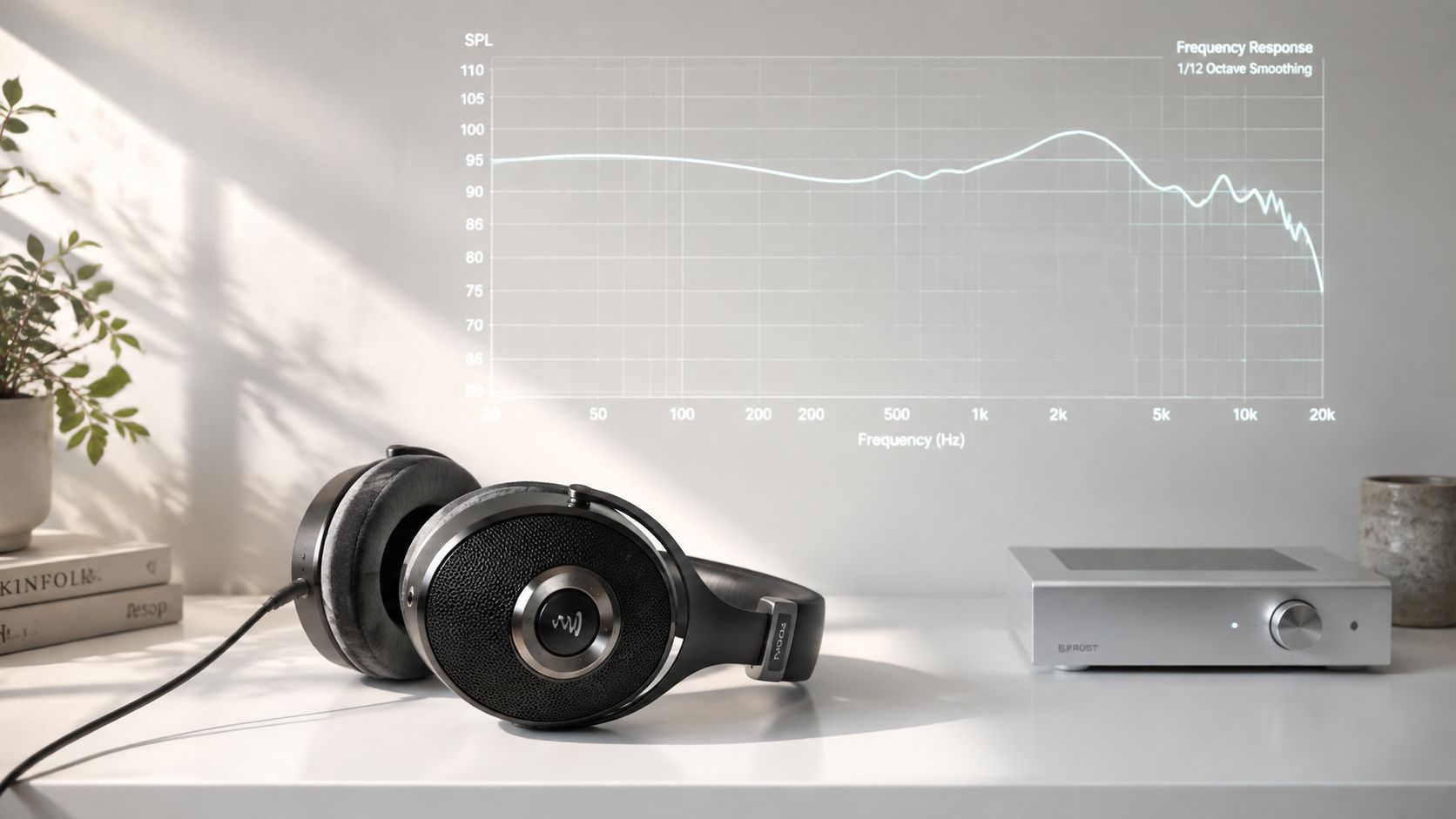
Headphone frequency response is the SPL-versus-frequency curve a headphone produces at the ear, not the printed “20 Hz to 20 kHz” badge on the box. The useful measurement window usually runs from 20 Hz to 20 kHz, because that lines up with the nominal range of human hearing, but the important part is the shape of the line, not the endpoints. A headphone can claim the same range as another and still sound dramatically different if one has more bass energy, a recessed lower midrange, or a treble peak.
What the ear actually hears from the curve
As a listening shortcut, energy below about 200 Hz reads as bass lift, weight, and warmth. Emphasis above roughly 6 kHz tends to land as more treble energy, more edge on cymbals, more hiss on consonants, and more perceived detail whether you wanted it or not. That's why two headphones with the same headline range can sound miles apart.
The other piece people miss is that the ear itself is not a flat test fixture. Measured at the eardrum reference point, a headphone will be anything but flat, and there's a marked 2 to 3 kHz peak baked into that anatomy. That's one reason serious target curves are compensated references, not literal horizontal lines. The headphone is being judged against hearing, not against a ruler.
If you want a more technical primer on how different driver types reach those shapes, I've got a separate breakdown on dynamic driver versus balanced armature design, which matters because different transducer choices tend to bring different response quirks.
How to Read an FR Graph Without Lying to Yourself
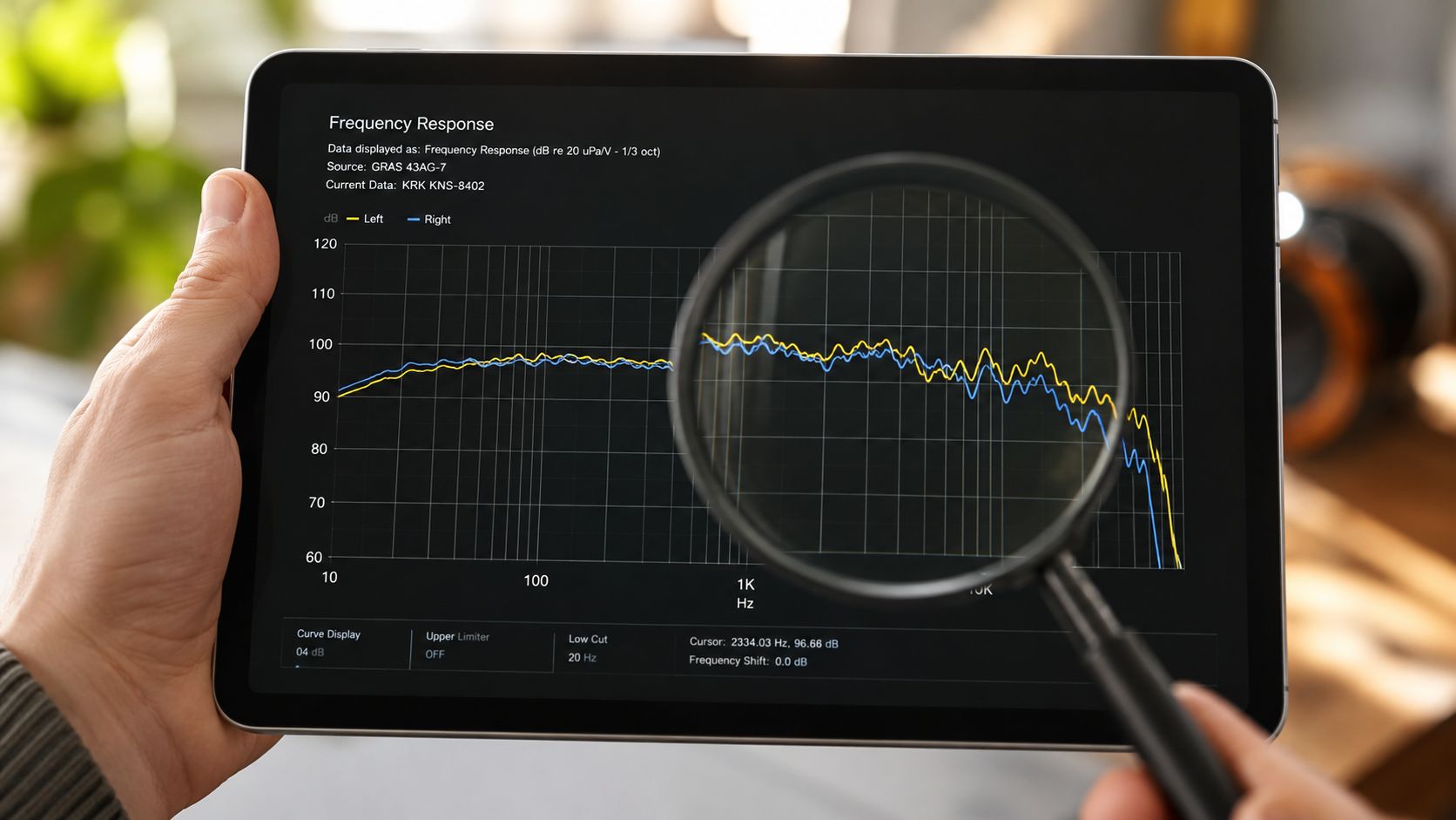
Start with the axes. Frequency runs on a log scale, so equal spacing on the chart does not mean equal jumps in pitch. Level sits in dB, so a rise that looks modest can still be easy to hear if it holds across a broad band. The gridlines tell you whether you are looking at a mild tilt or a real tonal shift.
A good FR graph rewards patience. Read the broad shape first, then the shelves, then the wide dips, and leave isolated notches for last. Those narrow cuts are often the least trustworthy part of the picture, because tiny changes in fit, coupler seal, or measurement setup can make them look larger or smaller than they really are.
Tolerance bands change the whole story
A raw range like 15 to 28,000 Hz is weak information by itself. Add a tolerance such as −3 dB, and the number becomes useful, because it shows how far down the response is allowed to fall before the claim stops saying much. A listing like 15–28,000 Hz (−3 dB) tells you more than the same range with no deviation attached. That is the difference between a technical statement and a brochure line.
The same logic explains why extreme tolerance specs can be slippery. One headphone can be described with a wide range at a loose tolerance and a narrower range at a tighter one, while the driver itself has not changed in any magical way. The range did not become better, the definition changed. That is why the printed spread is often marketing, while the tolerance and the curve shape do the actual work.
Look at the broad tilt first. Then the shelves. Then the broad dips. Leave isolated notches for last, because those are often the least trustworthy part of the picture.
A second habit helps. Scan the overall contour before you fixate on single bumps. A headphone that rises gently through the bass, dips in the lower mids, and lifts again in the treble will sound very different from one that stays more even, even if both share the same endpoint numbers on paper. The graph is a map of balance, not a badge of bandwidth.
The Target Curves That Actually Run the Conversation
There is no single neutral in headphone land. What exists are target curves, and each one tries to approximate either what listeners tend to prefer or what engineers can repeat from one measurement to the next. The Harman target gets treated like a consensus because it sits closest to a broadly preferred reference. Older diffuse-field and free-field ideas came from a different problem entirely, repeatable comparison, not a response that flatters a playlist.
Repeatability came first, taste came later
A JAES paper on studio headphone standardization reported that diffuse-field responses were typically within ±1.5 to ±2.5 dB at maximum spread, with standard deviation within ±2 dB even at high frequencies JAES studio headphone standardization paper. That is not a random footnote. It shows how hard the industry pushed for consistency once headphone measurements started being used to compare one model against another. The odd part is that better repeatability did not give us a flat consumer market. It just made the differences easier to see, and harder to hand-wave away.
A 2023 market analysis from market research measured close to 10,000 headphones, and the weighted average response showed a pronounced smiley curve, with boosted bass and treble plus roll-off above 7 kHz and below 90 Hz 2023 market analysis of headphone responses. That is the part people keep trying to dress up as a debate about purity. It is really a record of what sells and what people keep putting on their heads.
The market concentration figures point in the same direction. The top 10 headphone models accounted for 36% of global market share, the top 3 alone reached 19.2%, and only 17 models exceeded 1% share. Most listeners are living with a small number of tunings, not an endless menu of ideals. The market does not reward flatness as often as reviewers like to pretend. It rewards a shape people find pleasant fast.
A literal flat line is still the wrong goal, because the ear is not flat and music is not flat. A V-shaped signature is also a choice, not a law of nature. Pick the curve that fits the work you do and the tone you want, then stop dressing preference up as engineering virtue. If you are checking why some models feel loose in the low end while others clamp harder and measure differently, the short answer often starts with fit and headphone impedance, not with a prettier graph.
Why Two Reviewers Can Measure the Same Headphone Differently
Two people can measure the same headphone and get different graphs because headphone measurement has a few built-in headaches. Bass readings shift with seal, treble readings shift with placement, and nobody agrees on one perfect target curve. A pretty line is not the product. It is a proxy that moves when the fit moves.
The seal and the rig matter more than people admit
Sean Olive's analysis of 283 headphones is still the cleanest reminder that response quality does not sit on one neat ladder. Across those models, the root-mean-square error versus the preferred Harman target ranged from 2.5 dB to 13 dB Sean Olive's headphone response analysis. That spread is wide enough to separate “close enough to live with” from “why does this thing sound off all the time.” It also explains why two people staring at the same model can end up arguing past each other.
The same research line found no correlation between retail price and measured frequency response. Price did not reliably predict response quality, even though variance at low frequencies narrowed a bit in higher-priced models. That should put to rest the lazy shop-floor myth that a bigger MSRP automatically buys flatter sound. It doesn't.
The first thing I check is fit, because fit changes the bass faster than listeners want to admit.
The electrical side also gets blamed too quickly. If you want the broader explanation of that piece, I've covered what impedance means in headphones elsewhere, but the FR lesson here is simpler. The seal, the rig, and unit-to-unit spread all sit inside the measurement. One reviewer's clean graph can become another reviewer's mild mess for reasons that have nothing to do with taste.
The honest way to read these plots is to trust trends, not tiny features. If several measurements agree on a broad bass shelf or a repeated treble dip, that is useful. If one graph shows a lone needle-thin spike, I treat it as a suspect until proven otherwise. The graph is evidence, not a confession.
What the Curve Features Actually Sound Like
A bass shelf below 200 Hz adds warmth when it stays modest, and turns into bloom when it goes too far. On kick drum and synth bass, that extra energy can feel satisfying, even expensive, because the sound picks up body and weight. Push it harder and the low end starts taking over the space in your head while the rest of the mix feels smaller and less defined.
The middle is where voices either live or get mugged
A lower-midrange recession around 200 to 500 Hz gives that hollow, scooped shape people call clean until vocals start thinning out. It can flatter dense mixes because it clears room, but it also strips weight from male voices, toms, and the woodier part of acoustic instruments. The result feels polished at first contact and a little suspicious after ten minutes.
A dip around 2 to 4 kHz usually comes across as polite, laid-back, or slightly distant. Some listeners hear that as easygoing and less tiring. Others hear a headphone that keeps the singer a step behind the mic.
A peak in the same 2 to 4 kHz zone is the classic shouty area, the one that pushes vocals forward and makes cymbals sharper than they should be. If that ridge is narrow and hot, consonants start to hiss and electric guitars pick up a papery bite. That is not detail, it is glare with a neat surface.
The under-discussed part is spatial placement. Academic work from the ICA proceedings found that irregularities in the 100 to 1600 Hz band especially affect front-back discrimination in headphone spatial perception ICA proceedings on headphone spatial cues. So yes, frequency response changes tone. It also changes where sounds seem to sit in your head, which is why some headphones feel oddly inside the skull even when the top end looks civilized.
How that happens also depends on design. If you want the housing side of that trade-off, the basics of open-back vs closed-back headphones matter because enclosure behavior changes how those peaks and dips land.
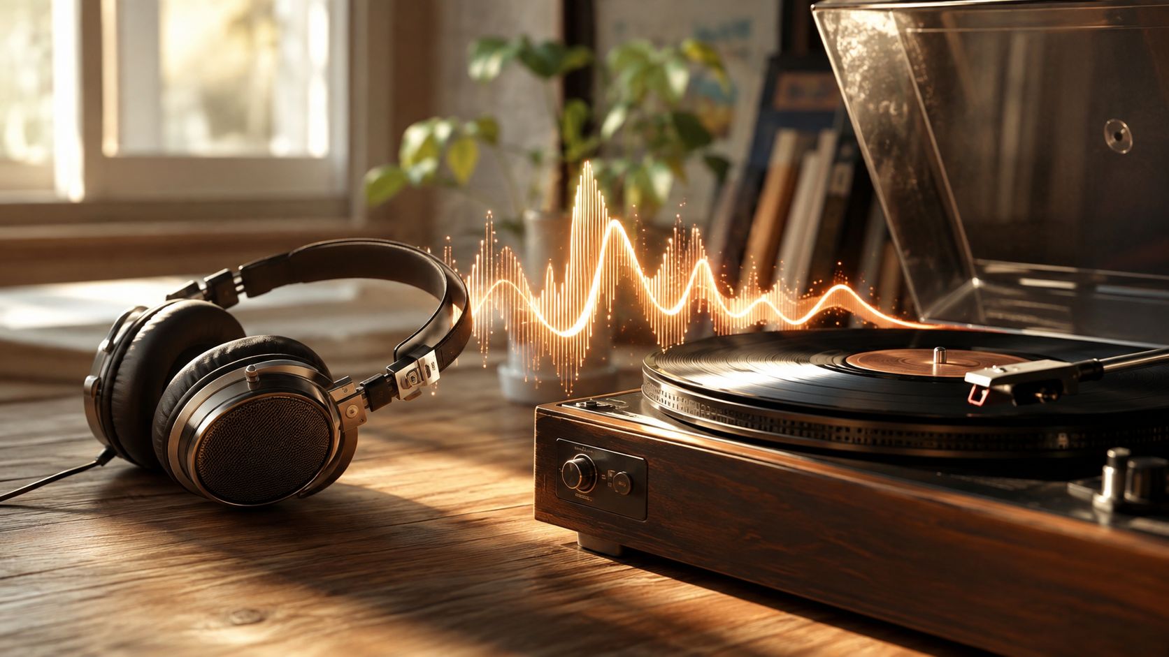
Listen long enough and the vocabulary stops being abstract. Warm. Thin. Shouty. Dark. Airy. Boxy. Those words are curve shapes translated back into ears.
Using Frequency Response When You Buy or EQ
Buying by frequency response works best when you use it as a filter, not a final answer. First, decide what shape you like. Some people want more bass weight for modern pop and electronic music. Some want a flatter midrange for voices and guitars. Some want the treble kept civil so they can listen past dinner without fatigue.
A sane buying checklist
- Match the curve to your habits. If you live on bass-heavy mixes, a tilt toward warmth may save you from constant second-guessing.
- Treat the printed range as marketing. The range tells you almost nothing without tolerance and curve shape.
- Check for broad shelves and dips. Those change tone more than isolated spikes do.
- Assume the seal will lie to you at least once. Especially in the bass, the first fit isn't always the final fit.
- Use the graph to predict EQ, not to worship a model. The best curve is the one you can hear through, or shape on purpose.
That last point is the one many listeners miss. The core value of a target like Harman isn't that it settles every argument. It gives you a baseline. From there, you can choose more bass, less upper-mid push, or a softer top end with intent instead of guesswork. EQ is just controlled disagreement with the graph.
I trust headphone frequency response graphs most when they explain a sound I already heard, and least when they try to dictate taste. That's the right level of respect. Study the curve. Argue with it. Don't obey it.
If you want the shorter version without the lab perfume, keep reading graphs for the shape, not the slogan, and then compare what you see with what you hear on your own head. If this helped, check out more of Supermarket Sound and keep the conversation going from there, because the next decent headphone you buy will probably be decided by a curve, a seal, and one honest listening session.

